










nv-design is deeply rooted in empathy and clarity representing a rare blend of heart-led and high-standard design.
We help purpose-driven practitioners, founders, and organizations create impactful brands and websites that inspire trust, connection, and growth.
Our approach combines design, psychology, and strategy to produce custom innovative designs that feel as good as they look.
Our work's New York–based sophistication communicates global-class quality while staying warm, personal, and authentic.
We deliver holistic system-level design solutions which focus on building cohesive ecosystems, not isolated piecemeal assets.
Our proven transparent process of collaborative iterations reduces client anxiety, builds trust, and guarantees success every time.
To learn how nv-design can help you elevate your brand’s online presence, please drop us an email or fill out a form.
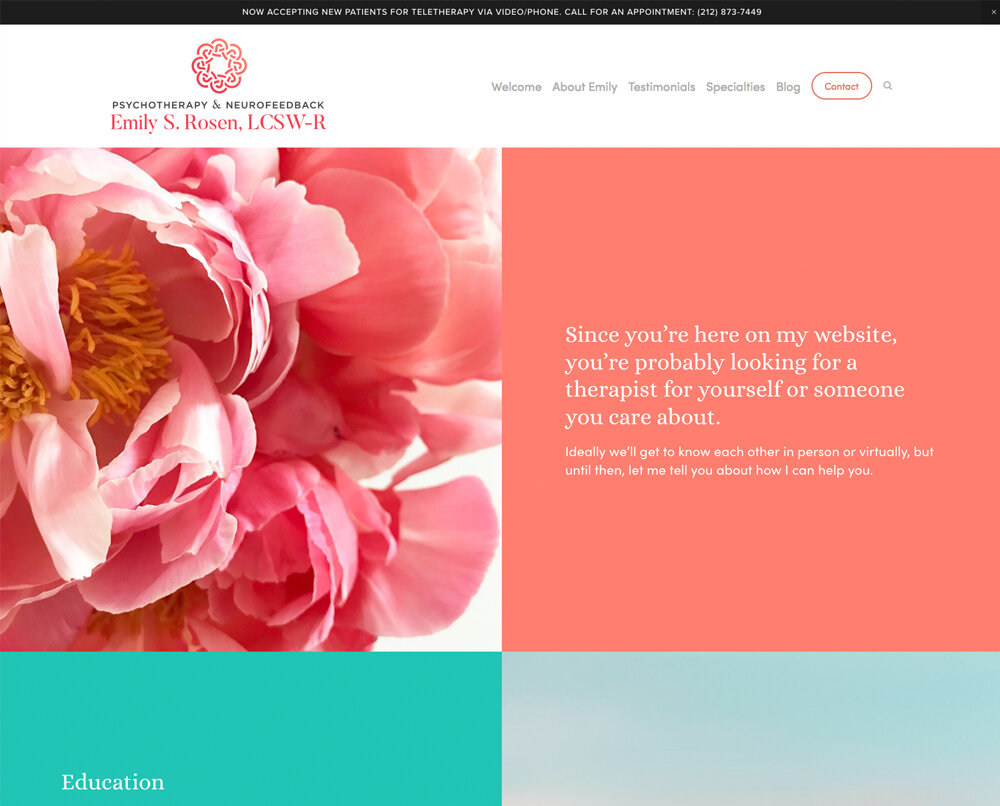
This website and branding was created for a New York therapist Emily S. Rosen, LCSW–R. The intention for the new brand was to create a colorful, warm and inviting digital portal to invoke the nurturing and deeply compassionate therapeutic space Emily provides for her clients.
The design was a seamless, highly collaborative and joyful process.
www.emilysrosen.com
Dr. Mary Rzeszut, DSW, LCSW is an experienced therapist specializing in medical social work and a deep understanding of the mind-body connection. She works with those who live with a chronic illness, chronic pain, and assists organ transplant candidates/recipients to regain an optimal quality of life while managing the symptoms of the illness.
Our objective was to properly showcase the depth of Mary’s expertise, and to create a sophisticated professional brand highlighting the importance of her much-needed offerings and her deep commitment to the patients.
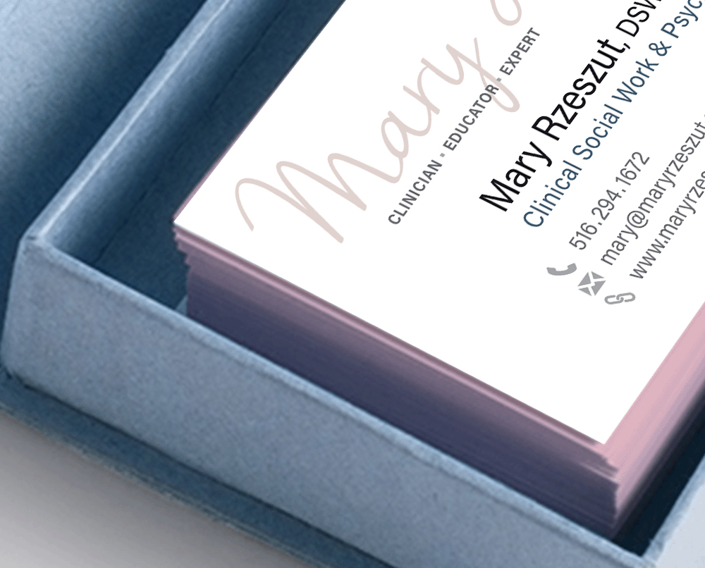
nv-design started by designing a custom monogram whose cursive handwritten letterforms conveyed Mary’s highly personal approach. Then we designed and built a website carefully crafted to reference the warmth, empathy, integrity and passion Dr. Rzeszut brings to her work.
nv-design kept developing the new business identity applications that included branded social media presence for LInkedIn and beyond, eBlast templates, and the inaugural email announcing the rebrand. They all served to reinforce the first unforgettable impression, ensuring its consistency across different channels and touchpoints.
At the end of the process, a set of beautiful classic business cards was designed and produced to the highest quality standards, ensuring that their recipients feel delighted and want to keep these on their desks.
We created a full-scale extensive branding system for Healing Hearts Changing Minds, a not-for-profit organization helping underserved communities gain access to psychedelic-assisted therapy and a leader in effective psychedelic altruism.
It included everything from a logo, stationery, business cards, event signage and promotional items – to a website, digital newsletter and document templates.
The key concept for the brand was inspired by kintsugi, a traditional Japanese artform of filling cracks in pottery with gold. It spoke to the idea that healing is possible for everyone.
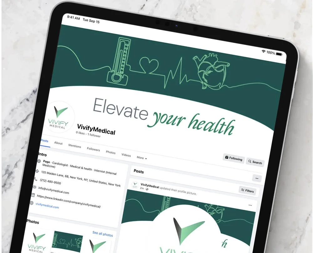
nv-design has completed a full branding and visual identity project for a top Cardiology and Primary Care provider located in the heart of New York’s Financial District. Vivify’s main focus is on high-touch personalized care and prevention.
Starting with a logo and a website, we developed a cohesive branding system that included a full set of unique marketing materials (brochures, one-page summaries, custom folders), as well as site-specific office signage, mailings, stationery, and promotional items.
The result: a clean and modern organic visual brand that feels warm and welcoming, successfully conveying the top-notch caliber of Vivify’s specialists. Every design touchpoint, from business cards to the office entrance signage, successfully embodies the client’s unique human-centered ethos. It prioritizes each patient’s wellbeing as expressed in Vivify’s innovative Medicine 3.0 thinking that centers prevention, personalization, and patient empowerment.
Website: https://www.vivifymedical.com
A women-owned cooperative that partners with non-profit, institutional, and commercial clients to help them with capital and real estate development.
Its core values are: equality, social and environmental responsibility, community service, diversity and deeply collaborative spirit throughout the entire design process.
The project began during the COVID pandemic when UPC did not have professional-quality team photos due to everyone working remotely during the pandemic. The practical but elegant solution had to come from thinking outside the box. To make up for the lack of high-resolution team photos, we represented the brand by a series of dynamic visual collages built of many pixel-like small authentic grayscale shots.
Another challenge arose from taking into account the client’s flat corporate hierarchy and shared team responsibility model. Unless facilitated carefully, a design decision-making process could easily become drawn-out and thus negatively impact the project’s downstream timeline.
Working closely with the UPC team, nv-design envisioned and built the new brand by skillfully guiding client’s own lateral consensus-building process. Together, we were able to cultivate their signature highly collaborative and transparent design approach.
After conducting an inquiry into the company’s DNA, nv-design struck just the right chord allowing to capture their unique essence and culture.
“This really feels like us!” was the best compliment a branding designer can hope to hear.
Website:
https://www.upcnyc.com
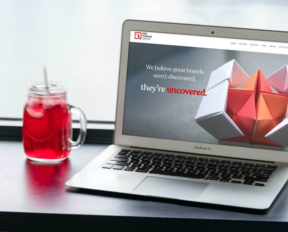
An Innovative brand system was created for Red Thread Group to reflect their bold forward-looking identity and innovative strategy approach.
Deliverables included a logo, a website, branded infographics with bespoke iconography, proposals, presentation decks, as well as social media branding and post templates. nv-design also assembled a custom image library to be used in the future marketing and communications.
Website:
https://www.redthread.group/
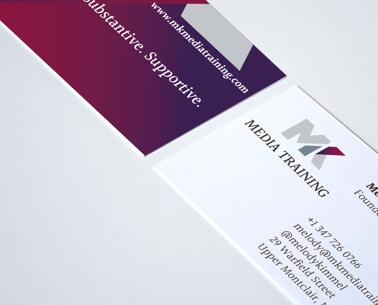
MK Media Training skillfully facilitates executive-level media training sessions. They offer corporate leaders an opportunity to master telling the story of their organizations with great power and transparency.
As a start-up company, this client urgently needed to have their entire visual identity created from scratch – so they could hit the ground running without delay!
We conceptualized and built the new company’s brand identity system which included a logo, letterhead, business cards, a training brochure, a set of tip cards, business presentation template, and a website.
This resulted in creating a cohesive professional-looking brand system which continues to elevate the company’s brand and helps them successfully grow their client base.
The client was empowered by the outcome and thrilled by the level of personal care, attention and guidance they received throughout the design process. This relationship became an ongoing creative partnership based on deep professional respect and mutual trust.
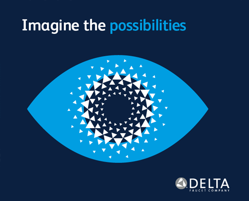
Delta Faucet Company is one of the largest U.S. manufacturers of residential and commercial faucets. It offers on-trend design with innovation that transforms.
Over the course of two years, we have been building out their employee brand through application of the iconic watermarks inspired by the flow of water. The expanded brand system includes a corporate brochure, a series of Glassdoor ads (shown here), four newsletter templates, a collection of five branded wallpapers in 14 sizes for a variety of digital devices and resolutions, as well as a set of 22 customized SAP icons.
Our ongoing collaboration continues to delight the client with fresh creative solutions.
CREATED FOR: MSL
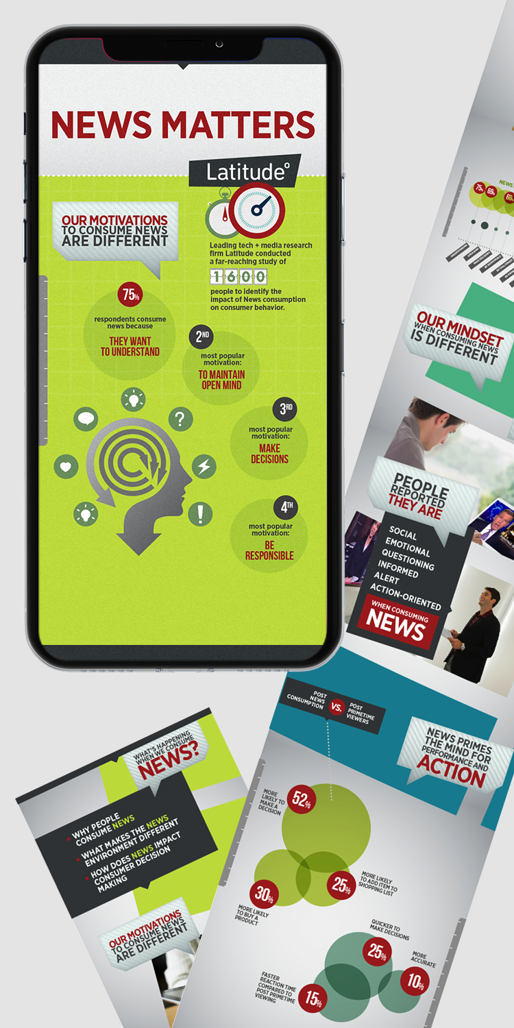
NBC News was in the process of examining the rapidly changing news market and recalibrating their message to better resonate in this new landscape. As part of this effort, they had spent two years exploring the question, “Why should advertisers place their message in the NBC News environment rather than any other news media environment?”
We were given the analytic findings of the two independent studies and asked to translate all the quantitative data into an easily digestible visual format. This digital summary report was going to be presented at the annual advertisers gathering, as well as in various internal meetings with NBC Universal top-level executives throughout the year.
After several working sessions with NBC analysts, we generated innovative ways to represent the study findings. The resulting Prezi presentation relied on animated infographics and unique chart types (such as spider charts and bubble charts) that best represented the complex statistical data. A new sub-brand was created for NBC News which was subsequently used as a standard for other department communications, presentations and social media assets.
As part of the process, we've designed a set of infographics to be specifically used in future publications and articles by the NBC's PR firm. At the same time, the Why News Presentation was shown over 40 times to senior executives and clients, collecting rave reviews from all.
We developed a fresh branding system for the CNBC Repositioning Initiative. The main goal was to showcase the programming success and upcoming steps as well as to get clients excited about what is happening during CNBC Business Day and CNBC Prime. The final presentation emphasized innovative ways to measure the network's performance by providing robust insights about CNBC viewers.
The newly created visual language was fully dynamic and flexible — it could work with a variety of data by reconfiguring a highly adjustable network of polygonal nodes. It also had an added benefit: the final digital delivery of the program's content to the advertisers was designed to be modular so that there were two different paths to choose from — CNBC Business Day or CNBC Prime — depending on the interests of the clients.
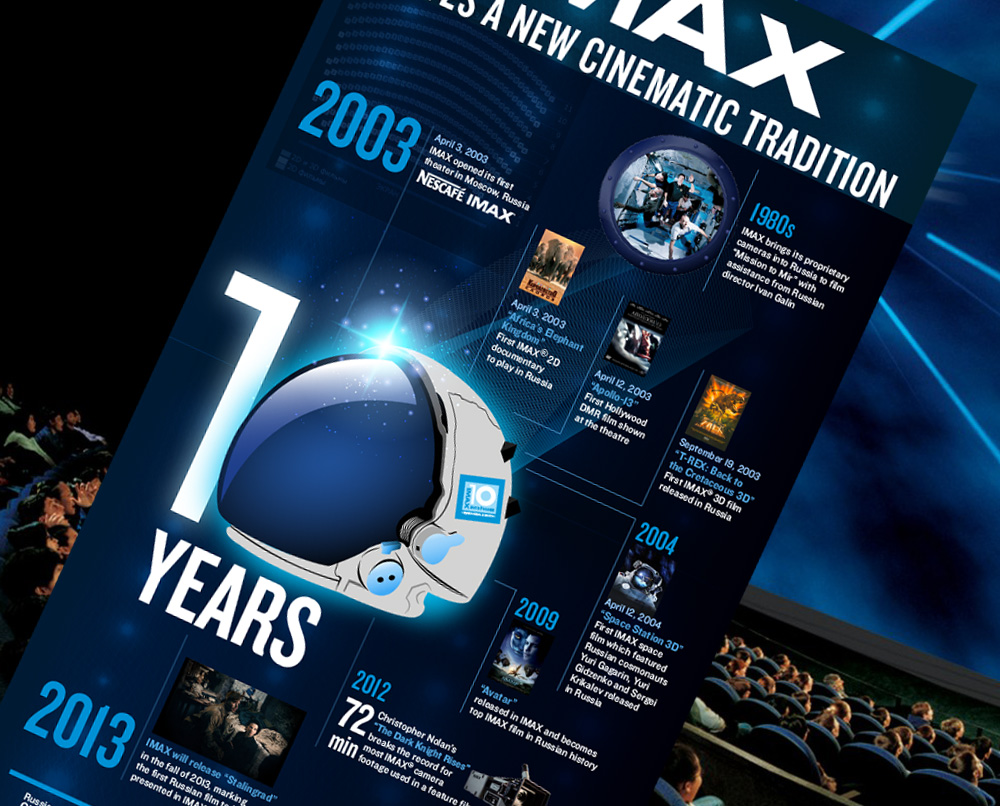
As part of Edelman's team, nv-design created special edition infographics for IMAX 10 year anniversary celebration in Russia. Produced bi-lingual designs in English and Russian for use in publications, social media and event signage.
CREATED FOR: EDELMAN
Novo Nordisk was preparing to celebrate the FDA approval of its revolutionary diabetes drug degludec. As part of Todd Street Productions team, we helped create a unique campaign through which team members could gain valuable insights about the brand and become motivated about the future of degludec.
This “Ordinary to Extraordinary” visual campaign uncovered the potential of degludec by using the metaphor of moving from the ordinary into the extraordinary. Using both objects and people, we brought the campaign to life. For example, loose-leaf paper represents the ordinary, and folded origami realizes the paper’s extraordinary potential.
The first phase of this campaign included object pairings, and the second phase used people. The last phase of the campaign also incorporated NNI team members’ suggestions of Ordinary to Extraordinary pairings. The end result was a cohesive branded campaign that showed the true transforming potential of the new brand.
In addition to the team graphics, the deliverables included branding posters, tent cards with celebration Invite, campaign pop-up banners and column wraps, edible fruit basket cards “Compliments of Launch Team”, “deglu” – daiquiri cups, and a set of presentation templates.
CREATED FOR: TODDSTREET
We created a new sub-brand within the EMD Serono family of brands for EMD Community Advisors. It included a logo, collateral, and signage.
CREATED FOR: MSL
EMD Serono is a pioneering company that advances science to treat specialty-care conditions, like multiple sclerosis, infertility and cancer.
We created a series of social media assets to be used on Twitter and Facebook. The concept was inspired by the images of cellular interconnections and biochemical research.
CREATED FOR: MSL
VF Corporation is a diverse conglomerate of iconic consumer brands such as Vans, Timberland, Lee, Nautica, Wrangler and The North Face, among others. While these components represented a broad spectrum of activities and lifestyles, the challenge was to find a focus and clarity in visually expressing the umbrella brand's message.
We refreshed and extended the brand's vocabulary and built a robust family of communications for VF Corporation. The new visual language was created with an intention to appeal to the new generation of consumers via digital platforms. Some of the deliverables included e-vites, newsletter templates, survey infographics, desk drops and a trifold brochure.
CREATED FOR: MSL
Today, IT professionals require good road maps to navigate the fast-shifting digital terrain. This set of three digital publications was created to guide them through mission-critical upgrades by directly addressing any urgent questions in a visually bold and immediate way. These booklets were meant to be a go-to resource for mitigating the thorny issues involved in the process of migration to Office 365.
Our design resulted in painless software migrations with zero migraines.
CREATED FOR: MSL
This brochure was created for Publicis Groupe's internal audience to promote the rollout of the new Font Service enterprise-wide approach to font management. To appeal to its target audience of the creatives within the company, the pamphlet is speaking their language in a playful and engaging way, drawing upon the history of typography.
CREATED FOR: Publicis Groupe
Re:Sources is a group that supports the world’s top marketing, advertising and communications agencies within Publicis Groupe. They take care of IT, real estate, procurement, insurance, legal, human resources, accounting and other functions.
The annual Re:Sources Value Cards campaign was intended to celebrate outstanding achievements of the nominated individuals based on their alignment with the company's five core values. The designed set included five color-coded individual cards as well as a summary card containing all the values.
CREATED FOR: Re:Sources/Publicis Groupe
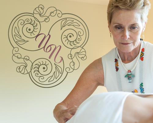
Website: www.nadiyahealingarts.com
Nadiya Nottingham is a yogi and a healer certified Medical Qigong Practitioner. For many years, she’s been training teachers, hosting Satsang, and leading workshops at The Integral Yoga Institute in New York City. It was time to redesign the Nadiya Nottingham Healing Arts brand to widen its reach and bring it into a fuller alignment with the core mission of helping more people heal.
nv-design started by bringing onboard Satya Lifestories (www.soulfire.studio) and art directing a photoshoot. We truly had to inhabit Nadiya’s world for the results to be authentically powerful.
For the website, nv-design created a beautiful visual encoding system to differentiate at a glance the various healing services offered by Nadiya. To create an inviting atmosphere steeped in the world of yogic science, we chose the language of ancient mudra hand gestures symbolizing each of the individual offerings.
We also designed a logo reflecting Nadiya’s Celtic roots and mystical sensibility.
The entire process was that of deep listening, tender collaboration and committed support. The result? The new brand felt like it was embodying the client’s "very soul.”
The goal of this project was to re-birth the Architects of Experience website and to share the extraordinary story of its founder, Eileen Moran. Eileen’s personal transformative journey prompted her to launch her heart-centered holistic sound healing practice with a special focus on treating cancer patients and survivors. The Architects of Experience website needed to reflect this new direction.
nv-design started by clarifying the website’s goals and defining its strategy, as well as conducting content inventory. The old website was no longer serving the new strategic vision. We added new sections, revamped the existing ones, and consolidated the old and new Events Calendar listings so that they can be updated by the owner directly.
We also redesigned the look and feel of the site to better represent Eileen’s new offerings in the holistic wellness area. The new airy and bright images were chosen to bring the message of healing, positivity and hope!
The entire process was a testament to the success of a collaborative approach, powered by compassion and a shared grand vision for the good of all.
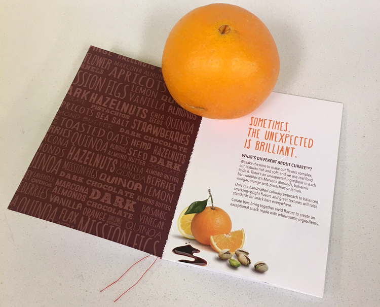
Curate is a new healthy snack brand that brings together hand-selected, wholesome ingredients to create unexpected, yet brilliant flavor combinations. The bars contain plant-based proteins & fibers with sweeteners from only natural sources — alll non-GMO and gluten–free and with no artificial preservatives, flavors or colors.
As part of MSL's effort to launch this brand, we have created an innovative pop-up booklet to include in media mailers and give out to key influencers at media events.
CREATED FOR: MSL
The Connelly Theater had a double billing featuring two plays in one night: one by Tennessee Williams, and the other by Marguerite Duras. The challenge was to create a campaign that focused on both equally.
After scripts review, a common meta-theme emerged: both plays mused nostalgically on the bittersweet longing, the elusiveness of memories and the ephemeral nature of time passing. We utilized some of the video footage from one of the plays along with newly commissioned outside photography to come up with a concept that spoke to the deeper emotional truth of the two plays.
In concert with the gradual unfolding of the stories, we employed a strategy of gradual reveal to convey a sense of intrigue to the potential viewers. The initial teaser had the image partially obscured, as if by a blindfold. Then it was revealed in the subsequently mailed postcard invitations, as well as in the posters and the programs found at the theater.
The opening night enjoyed phenomenal attendance and a palpable level of anticipation. The director was very happy to have her vision carried through each touchpoint. Intrigued by the mysterious buildup, audience members lingered in front of the posters before each performance, letting their imaginations run wild and fill the gaps. Some said they could discern a phantom face appearing in the poster image when they looked at it from a particular angle!
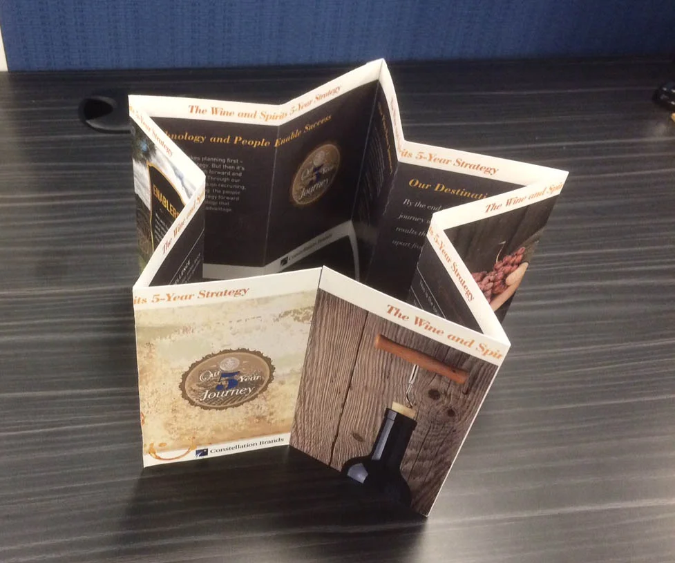
Constellation Brands is the world's leading premium wine company, with more than 100 brands sold in more than 100 countries. We were tasked with creating a memorable piece that could quickly convey to employees the division’s goal and strategy. This deliverable needed to to be produced in print form as well as to live digitally. The additional support materials with a greater level of detail were also to be included.
Our solution was to create a memorable star-shaped keepsake piece that employees would keep on their desks. The star could be opened to display the details of the five-year strategy plan as a foldout poster.
CREATED FOR: MSL
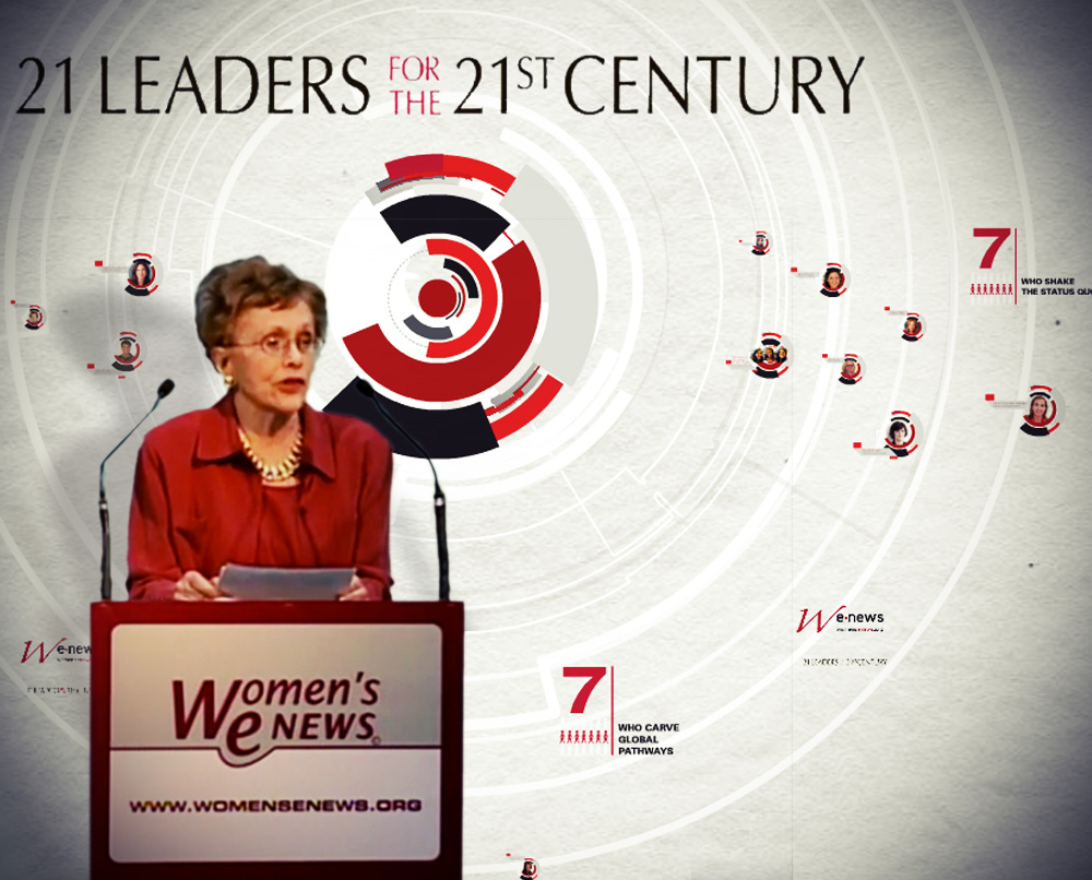
Women's eNews is an award-winning nonprofit that covers women's Issues and promotes integrity in journalism, empowering women and girls to take their rightful place in the world. Their annual 21 Leaders for the 21st Century celebration gala honors those who are challenging the dominant narratives through words and deeds.
We created a presentation in Prezi that told a compelling story of each nominee in one of three categories. The strong and colorful design scheme was inspired by the boldness and power of each of the individual women's journeys.
The client was absolutely delighted with the way their story was told. They proudly shared it on their website and through all their social media channels, where it continued to inspire a new generation of women.
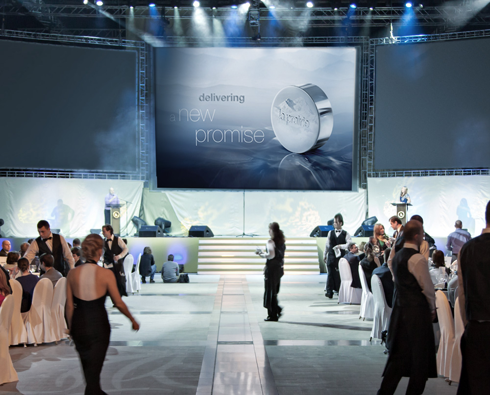
La Prairie is one of the leading high-end cosmetics and skin care brands in Europe and the United States. Their 2015 annual product launch in Dubai was an event of great magnitude, with a goal to generate an unprecedented level of excitement about four new product lines.
Working with four teams simultaneously made for an incredibly fast-paced project. It required a high degree of autonomy and a take-charge creative direction while meticulously managing the workflow – that of my own and another designer.
Another challenge came from the fact that the product assets for the brand new product lines (such as packaging photography and 3d renderings) had not been generated yet, so many mockups had to be created on-the-fly.
Applying a bold approach — more commonly found in glossy publications — to design and typography, we created a stunning new visual standard that was replicated across all the product lines. The final result overcame all expectations with the refined quality and timeless elegance that La Prairie's products are known for. The Global Brand Development VP commented that the evocative event visuals appealed to the audience on a very deep visceral level.
The product launch was a great success with the company's executives, managers and beauty advisers. We were asked to do a similar process for the following phase of the product launch in Paris.
Developed contemporary-looking report for the BMW Customer Relationship Management in North America to present at the Annual Roadshow.
CREATED FOR: MSL
Melting Morsel fine bakery needed a new look that was sophisticated and contemporary, just like their mouth-watering gourmet desserts. The pattern that became their visual signature was inspired by the traditional decoration of Napoleon minis, one of the bakery's specialties.
Expressing gratitude has been shown to have a positive transformative effect on people's lives.
It is in this spirit that the Gratitude Migration Festival was founded. Its intention is to bring people together to celebrate life and to inspire creative, innovative and positive transformative change in the world. Gratitude Migration: Summer Dream 2016 brought together 3,000 people.
In collaboration with artist Emily Sause, we created a 7-day Gratitude Journal to print and distribute to the participants.
These journals were so popular that they were gone almost immediately due to the high demand!
The Rubin Museum of Art is an arts and cultural hub in New York City that inspires visitors to make cross-cultural connections between contemporary life and the art and ideas of the Himalayas. It provides immersive experiences that encourage personal discoveries and spark new ways of seeing the world.
We designed and animated an AfterEffects video sequence to be displayed at Rubin's gala fundraiser. It was shown on the large screen during the times when the guests were filtering into the space, as well as throughout the dinner.
Showcasing the select moments from the museum's life, the video served as a testimony to the great work done by the institution in a course of the year. It delivered a powerful emotional impact, influencing potential donors to increase their support of The Rubin Museum.
RushCard was envisioned to be a revolutionary credit product designed to lift millions of Americans up and out to a more financially secure and free future.
We participated in the initial phase of color and branding explorations as part of the overall brand development by Merkley+Partners. This included initial design direction, color palette, typography and logo options for the credit cards. Our goal was to create an appealing system of edgy styles for users to choose from, engendering a sense of excitement, hope, connection, and ownership.
Additionally, we developed a system of digital communications promoting the RushCard launch.
Designed to enhance the well-being of guests and associates around the world, Westin launched a year-long initiative introducing a string of innovative partnerships and programs across Westin’s six brand pillars: Feel Well, Work Well, Move Well, Eat Well, Sleep Well and Play Well.
To bring more awareness to these initiatives, the concept of The Westin Well-Being Movement was born. A yearlong global activation, the Movement featured innovative social media programming and experiential activations. Examples included Meditation Moments in iconic NYC locations and partnerships with renowned experts like Arianna Huffington.
We designed the brand graphics, custom suite of icons and the collateral for these programs that was seen across 200 properties around the world. The materials included posters, a website, digital signage at check-in desks and guest room key cards.
CREATED FOR: Taylor Strategy
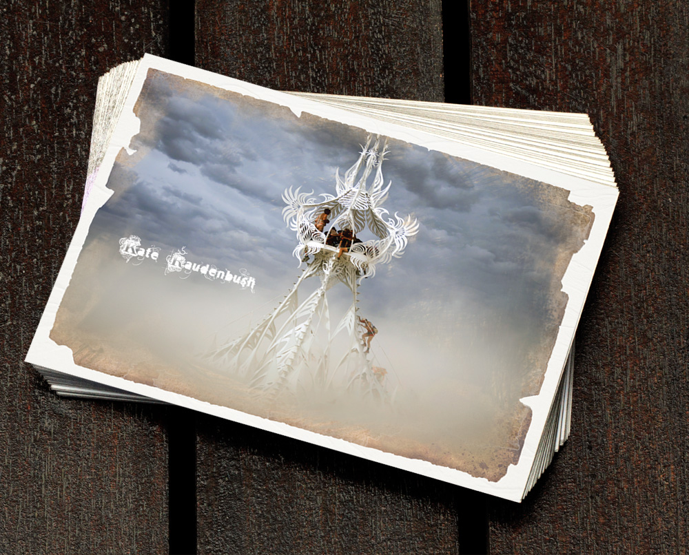
Kate Raudenbush is a New York-based artist specializing in laser-cut colossal yet delicate metal sculptures. Over the years, we have collaborated on creating her brand from the ground-up as it has taken shape through many promotional pieces such as posters, invitations, boards, brochures and postcards for various benefit galas, exhibits and events.
The latest project was a self-promo card designed to feature the artist at the annual Art Basel show. The logo was meant to evoke the ethereal quality of Kate's metal work.
The Chosen Family Law Center, Inc. is a nonprofit corporation dedicated to cultivating equitable social and legal recognition of Lesbian, Gay, Bisexual,Transgender, Queer, Intersex, and Asexual (LGBTQIA) and polyamorous families and individuals, as well as other underserved family forms such as platonic co-parents or multigenerational families.
The dynamic logo system is designed to reflect the multitude of the family structures within the community served by CFLC. It can be reconfigured to show specific family types, or deconstructed into geometric elements symbolizing flexibility, fluidity and cooperation.
To build on the geometric visual language of the logo, we extended the brand by creating an at-a-glance flyer providing an overview of the CFLC’s work. It was used to continue the fundraising efforts online when the annual 2020 Gala had to be canceled due to COVID-19.
"Our World, Our Family" was a signature corporate social responsibility (CSR) program of Western Union and the Western Union Foundation. The program was a five-year, $50 million commitment to promote economic opportunity for migrants and their families worldwide.
To showcase the program’s remarkable impact, nv-design was invited to create an innovative animated corporate philanthropy report, which was announced to shareholders on International Corporate Philanthropy Day.
Charley Wininger is a licensed psychotherapist working with individuals and couples in the New York City area for the past 30 years. He is also the author of “Listening To Ecstasy,” a memoir about his MDMA experiences.
Charley believes in connecting people with themselves and each other, and in building empathy and compassion between them. As an author, he is “opening our minds to astonishing possibilities as we boogie across the lifespan.”
nv-design built a branding system based on the logo symbol that acquired the playful moniker of “Molly The Dancing Bear.” In keeping with the open, creative and experimental spirit of the book and its author, we conducted a crowd-sourced drawing contest inviting people to sketch Molly in various habitats.
The awareness-raising campaign started while the book was still in the manuscript stages. As a result of the campaign’s impact and cohesive branding across YouTube, Instagram and Facebook, the movement has been steadily gaining momentum on social media.
A beautiful labyrinthine logo represents the long and arduous spiritual journey one embarks upon in search of healing.
The logo withstood the test of time and became a central part of the new business identity for years to come, It was used by the client in everything from business cards to the website.